
本記事でできること

環境構築はこちらになります。

環境
$ npm -v
7.21.1
$ node -v
16.9.1
説明
種類
| 属性 | 説明 |
|---|---|
| mat-button | 通常のボタン。背景、枠線がなく、フォーカスを当てると薄い背景が表示される。 |
| mat-raised-button | 長方形のボタン。背景色、枠線がある、一般的なボタン。 |
| mat-flat-button | 長方形のボタン。背景色はあるが、枠線がないボタン。 |
| mat-stroked-buton | 長方形のボタン。背景色はないが、枠線があるボタン。 |
| mat-icon-button | アイコンだけの表示したボタン。 |
| mat-fab | 丸型のボタン。中にアイコンや文字を1つ表示するボタン。 |
| mat-mini-fab | mat-fabを小さくしたもの。 |
Material Symbols and Icons - Google Fonts
Material Symbols are our newest icons consolidating over 2,500 glyphs in a single font file with a wide range of design ...
fonts.google.com
専用パラメータ
| パラメータ名 | 説明 |
|---|---|
| color : ThemePalette | ボタンの色。basic、primary、accent、warnなどがある。 |
| disabled : boolean | ボタンの活性状態。 |
専用メソッド
| メソッド名 | パラメータ | 説明 |
|---|---|---|
| focus | origin : FocusOrigin ? options : FocusOptions ? | フォーカスされた際に発火されるイベント。 |
ソースコード
全量は、こちらになります。
GitHub - kiji-tech/blog-angular-material at button
Contribute to kiji-tech/blog-angular-material development by creating an account on GitHub.
github.com
参考文献
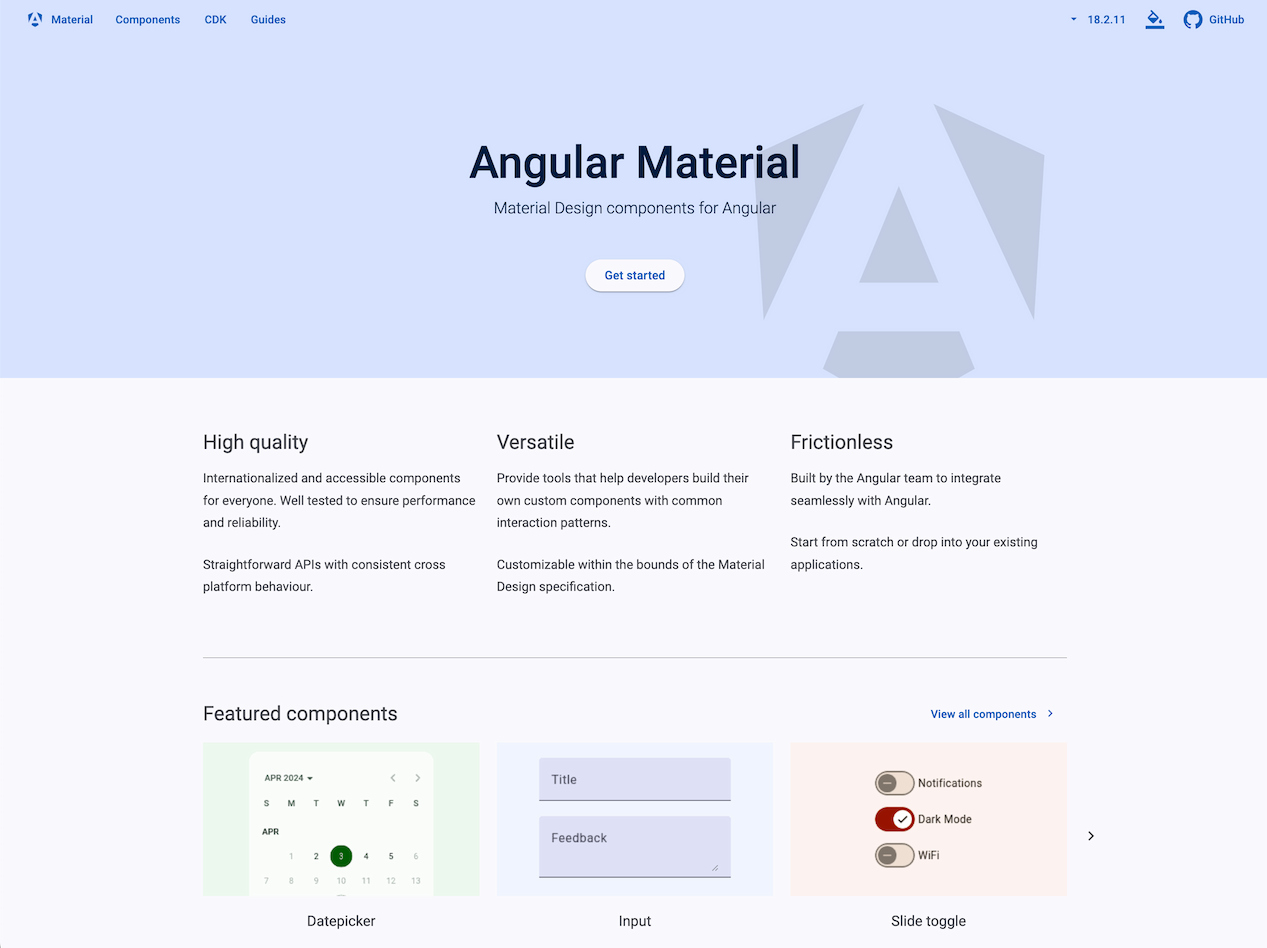
Angular Material
UI component infrastructure and Material Design components for Angular web applications.
material.angular.dev


コメント